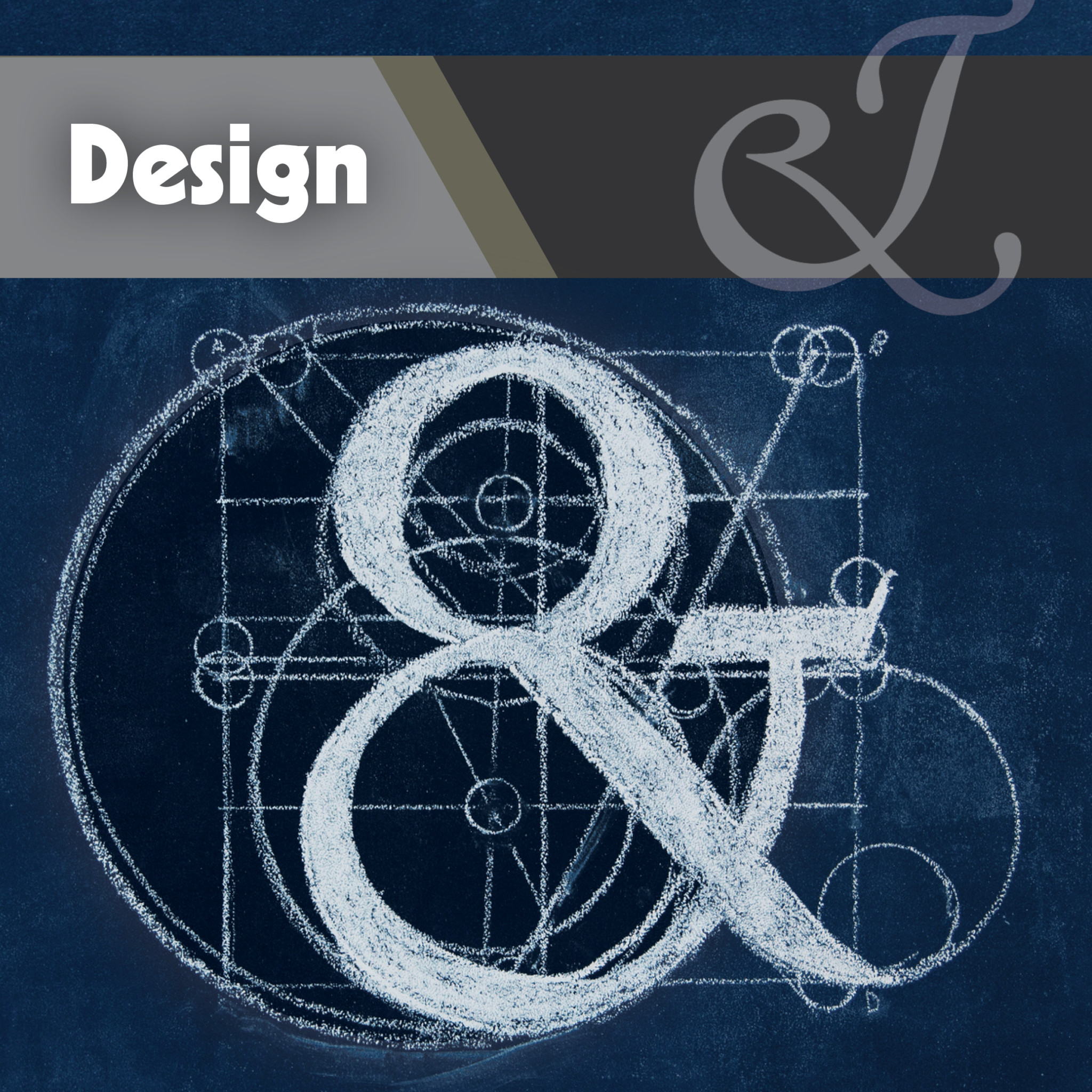
What Character Was Kicked Out of the Alphabet?
The Ampersand. Johnson & Johnson, Barnes & Noble, Dolce & Gabbana: the ampersand today is used primarily in business names, but that small character was once the 27th part of the alphabet. What’s that about?
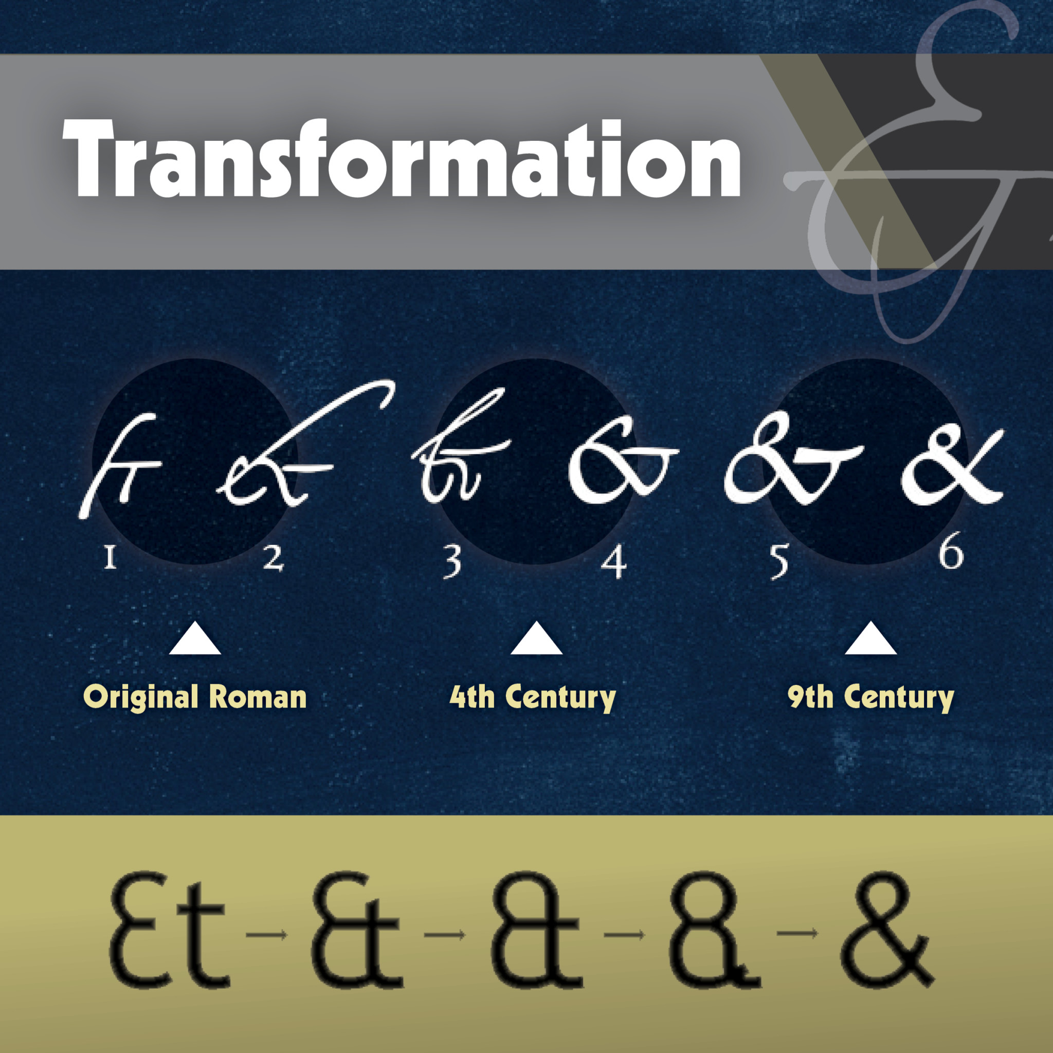
It’s old news, really. The shape of the character (&) predates the word ampersand by more than 1,500 years. In the first century, Roman scribes wrote in cursive, so when they wrote the Latin word et which means “and” they combined the e and t. Over time the linked letters came to signify the word “and” in English as well. Certain versions of the ampersand, like that in the font Caslon, clearly reveal the origin of the shape.
You can see the evolution of the ampersand in the above imagery. #1 is like the original Roman ligature, 2 and 3 are from the fourth century, and 4-6 are from the ninth century. The modern ampersand has remained largely unchanged from the Carolignian ampersands developed in the ninth century.
The word “ampersand” came many years later when “&” was actually part of the English alphabet. In the early 1800s, school kids reciting their ABCs concluded the alphabet with the &. It would have been confusing to say “X, Y, Z, and.” Rather, the students said, “and per se and.” “Per se” means “by itself,” so they were essentially saying, “X, Y, Z, and by itself and.” Over time, “and per se and” was slurred together into the word we use today: ampersand.
So what happened?
The symbol disappeared from the alphabet in the transition of Old English to Modern English. Why it got bumped out is anyone’s guess, but there is a good chance that some credit goes to the ABC song we are most all familiar with. It gives no credit to the poor thing. The song was copyrighted in 1835, around the time that the ampersand started falling out of favor with the rest of the ABCs.
The Ampersand Lives On
Why is it still showing up, then? It must be for the deep, undying love so many have for it.
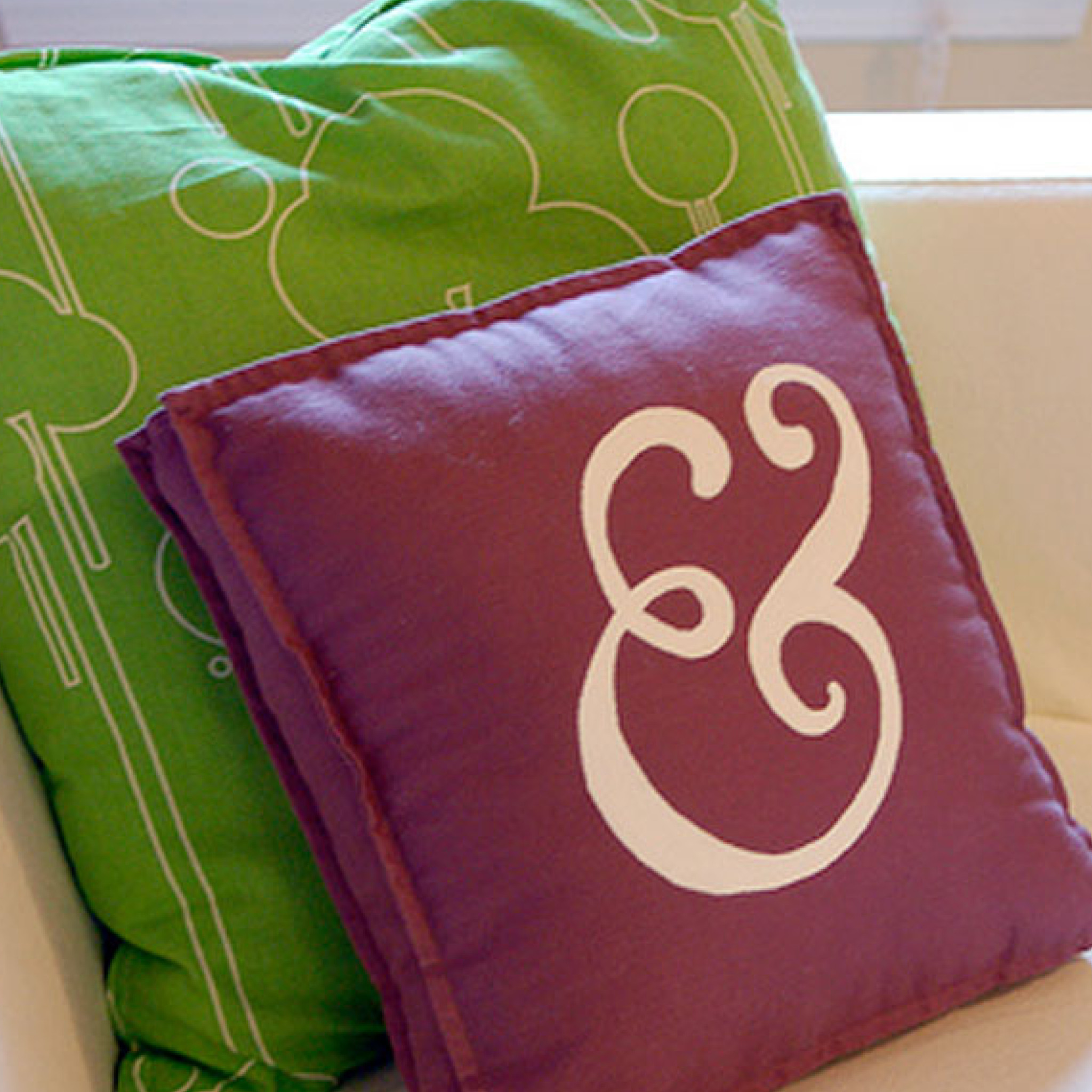
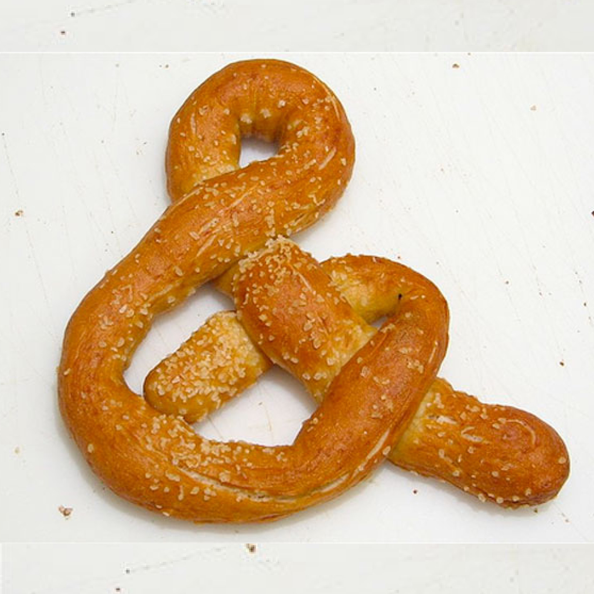
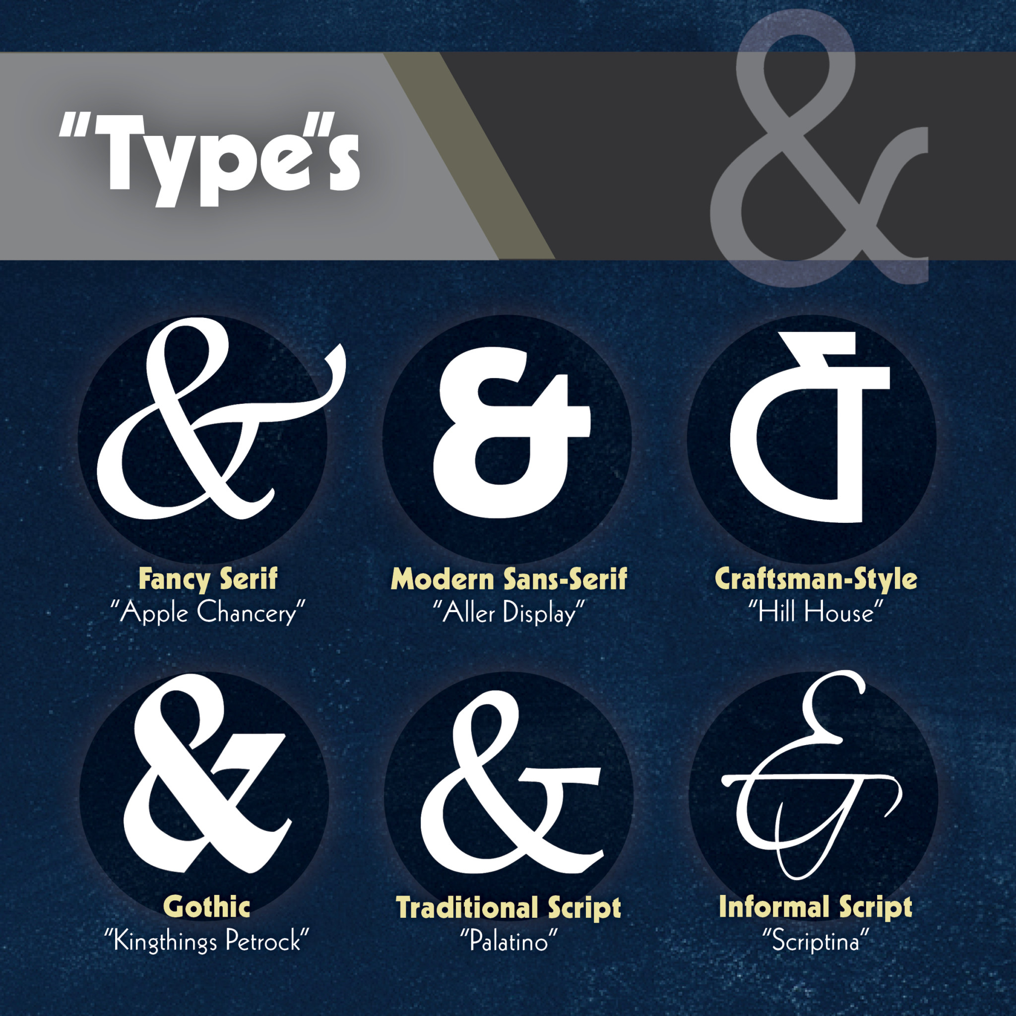
Ampersands have become a bit of an obsession for some. For starters, they are one of the most unique typographical characters out there. Besides companies welcoming the ampersand into their titles, the ampersand is experiencing a bit of a resurgence in general usage. For instance, it commonly replaces “and” in text messages and Twitter updates. It is typically included within weddings and other formal invitations. It is used frequently in computer programming, and even brought to life within home décor, on apparel, as tattoos, and even as pretzels.
A Delicious Design Ingredient
Typography designers can exercise a lot of artistic freedom in the design of the ampersand. This freedom ranges from very traditional representations to those that bear little resemblance to the original form. When used in titles or headers they can add some extra graphic impact without images. Ampersands can play a prominent role in the look and feel of a design. And this isn’t just a new fad, either.
“After the advent of printing in Europe in 1455, printers made extensive use of both the italic and Roman ampersands. Every new typeface and font has included its own style of &. Since the ampersand’s roots go back to Roman times, many languages that use a variation of the Latin alphabet make use of it.” -Wikipedia
Perhaps it’s just a beautiful form – perhaps it’s still unique enough to catch our eye – perhaps it’s not knowing what the heck it is that keeps most people attracted, or on the contrary, knowing it’s fascinating history of survival.

