
Fonts turn words into stories with influence.
When we meet someone for the first time, it is said that only 10% of the meaning we perceive is from the words that are spoken. Their tone, their dress, and how they carry themselves leave much more of an impact. Turns out, it is the same way with typography. Fonts are the life within the words we read, the message that we gather that goes without saying.
Fonts help us shop, keep us safe, and make us feel. They give a heads-up to what you will get when you open the package or choose a service. But how?
The Power of Tone
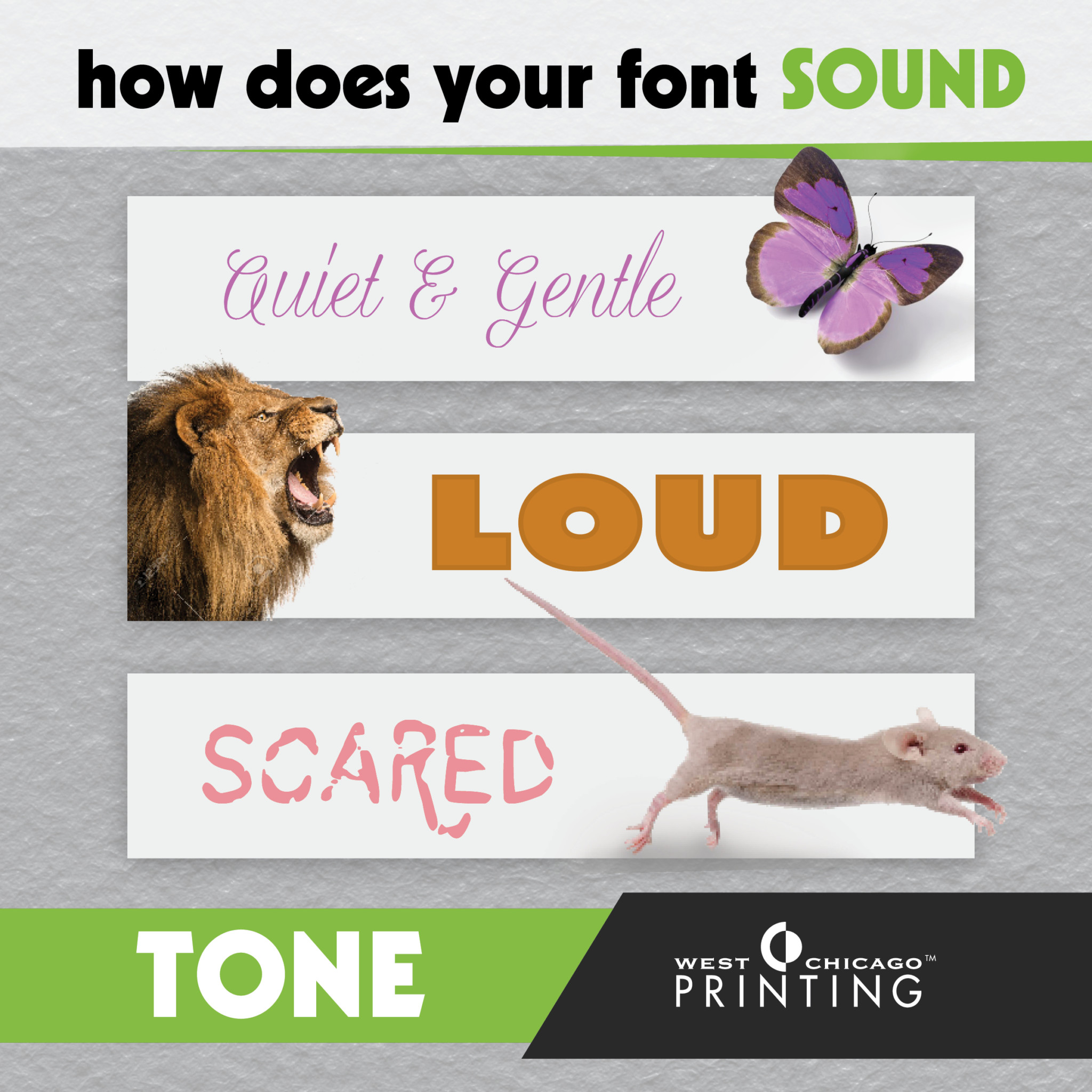
Successful typefacing puts a tone to the text we read. While our eyes look at letters, a typeface will whisper stories to us about the products, companies, or events that we’re reading about. This concert is for kids. A rounded block font might say. That restaurant is modern. Suggests a thin sans serif font. The dresses there are elegant. Notes a loopy script font.
While they will not actually speak to us, fonts will stir up our emotions and try to tell our brain how to react. While we consciously think about what the words are saying, our unconscious hears the tone of the typeface, and we are… influenced.
The Power of a First Impression
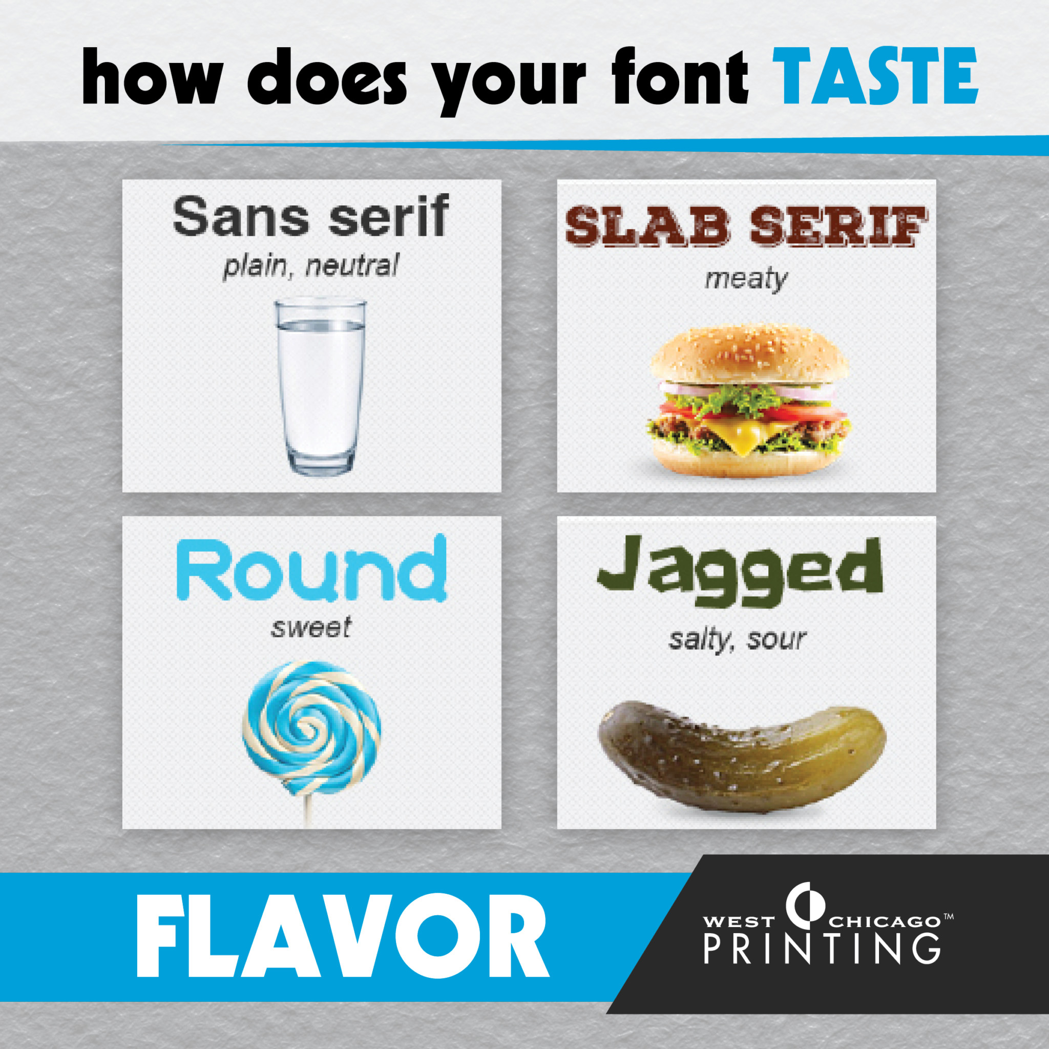
Like the clothes someone wears, first impressions can be instant. Most typefaces have a certain personality or flavor that we can then relate to, and respond to as readers and consumers. This “flavor” can be so strong, even, that our senses and emotions are affected. For instance, studies have shown that people not only find menu items more appetizing but also tastier, when they’re written in a font that compliments the food’s flavor.
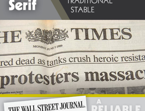
Take the Campbell’s soup logo for example. The curved letters suggest that the soup is homemade, smooth, calming, and even cozy. Or the Starburst logo, which glides through your mouth as you read it. The bold, glistening, bulging letters may even make your lips pucker from the flavor implied. Or on the opposite side of the spectrum, in seeing the confident headline of the Wall Street Journal, a reader knows he is stepping into a serious, conservative, financial territory.

The Power of Emotional Weight on Memory
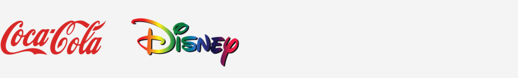
The act of looking at a certain font can involuntarily stir up powerful emotions or instill a sense of nostalgia. For instance, Coca Cola’s typeface has brought many a drinker back to a time when that script style was prevalent, and when the product first wowed its drinkers.
Ask any six-year-old to identify the Disney logo, and they’ll know exactly which business it belongs to. While the logo is instantly recognizable, it is not especially readable. Why does a company like Disney actively market to six-year-olds using such a complicated, hard-to-read script font? The emotional weight that the font carries delivers a subconscious message of whimsy and nostalgia. This feeling sticks with viewers young and old alike.
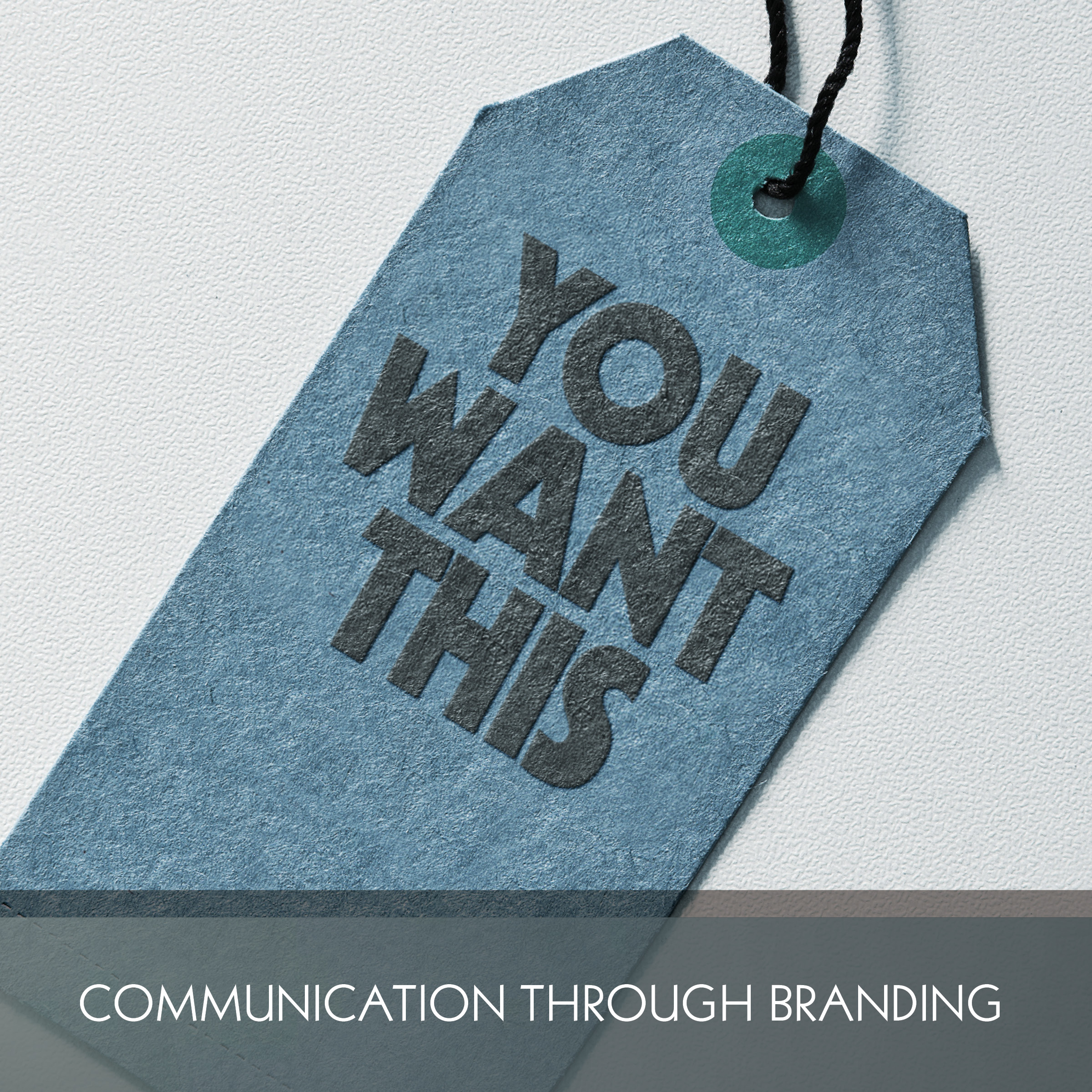
Have you ever been influenced by a font?
Though it is easy to love fonts, sometimes they bend the truth. A font can make something cheap and mass-produced look handmade, fresh and of great quality. It can make a new business look longstanding and historical. Or it can give an impersonal corporation a friendly, caring look. It can even give a clothing line a luxurious, exclusive feel.
Next time you’re considering a purchase, read between the text and listen to what the fonts are trying to tell you.
Are Your Fonts on Your Side?
Keep your recipients’ senses in mind when choosing fonts. If you’re marketing a brand of gasoline with a flowery, delicate typeface more suitable for a perfume, it’ll only confuse your audience.
Finally, if you have a business, what are the fonts you are using telling your customers about you? Consider a conversation with one of West Chicago Printing’s design specialists. We would love to help you tell your story with fonts!