


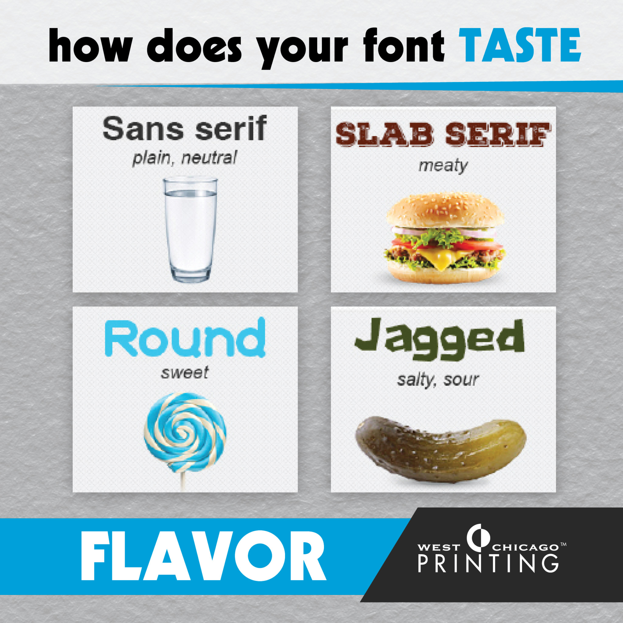
Fonts largely influence how an audience feels about a design. And to some extent, a simple font change can alter brand perception. Though we can’t generalize all fonts, for the most part, each font category is tied to a certain feel.
Serif | Traditional, respectable, stable
Serif fonts carry a distinguished feeling of heritage and pedigree. They make a brand feel respectable and reliable, instilling the audience with a sense of comfort that they’re in the hands of someone reputable and stable.
Sans serif | Simple, straightforward, sensible
Audiences perceive sans-serif fonts as clean and simplistic in a modern way. They allow the message to speak for itself without hiding behind a façade—straight and to the point in an objective way. Designers for web often use sans serif fonts. They carry a reputation for being contemporary and current no matter what decade you use them in.
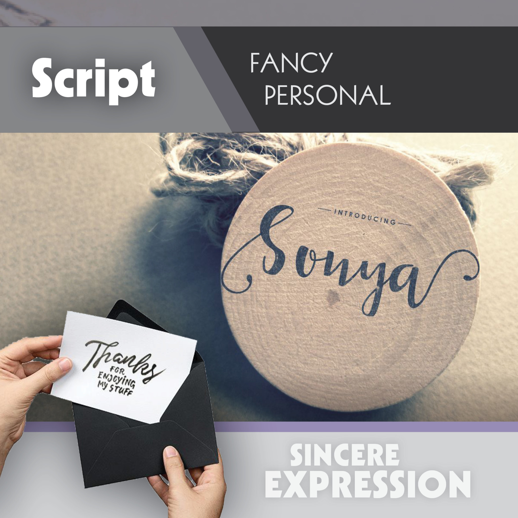
Script | Personal, feminine, fancy
Script fonts (and by extension most handwritten fonts) inspire feelings of elegance, grace, and femininity. We often use handwriting in expressions of affection. Because of this, audiences perceive these typefaces as personal, creative and genuinely heartfelt.
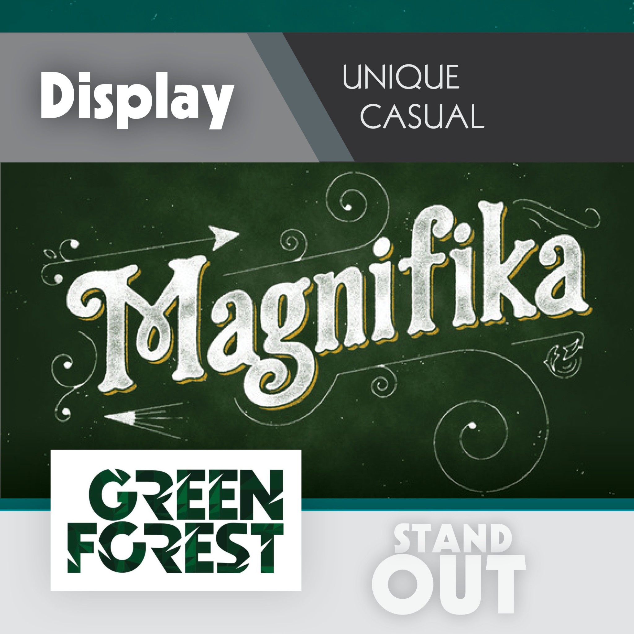
Display | Friendly, quirky, unconventional
Display fonts are meant to be, well, displayed at a large size (generally 14 pts. or higher). So, display fonts tend to have big personalities in order to draw an audience. Display fonts have to be a little on the loud side, so they’re often friendly or amusing and grab people’s curiosity.
Modern | Smart, trendy, forward-thinking
Audiences find modern fonts to be progressive, stylish and just plain cool. They can run the gamut from strong and sharp to futuristic and intelligent. They don’t just reflect the here and now, they set trends and the brands that utilize them carry the same reputation with audiences. Modern fonts reflect the possibilities that tomorrow may bring.
